←Back to portfolio
When search breaks, everything breaks
Designing a coherent search system for global markets across intent, discovery, and results
Company
Ocado Technology | Ecommerce
Tags
B2C · B2B · Strategy · AI
TL;DR
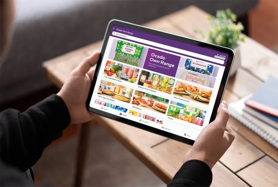
Search drove 70% of product adds on the platform. I led design across the full search system eco system of tools from consumer-facing to B2B tooling across 11 global partners. We improved converted searches improved by ~4.78%, precision by +4.43%, and zero-result conversion by +7%.
What made this complex
Search had to work for everyone, which in practice meant it couldn't be optimised for anyone in isolation.
Organisational complexity was a constant. Search touched multiple teams with unclear ownership, and decisions around ranking, filtering, and results behaviour were highly contested, particularly with risk-averse partners like ORL who were reluctant to change something that was broadly working.
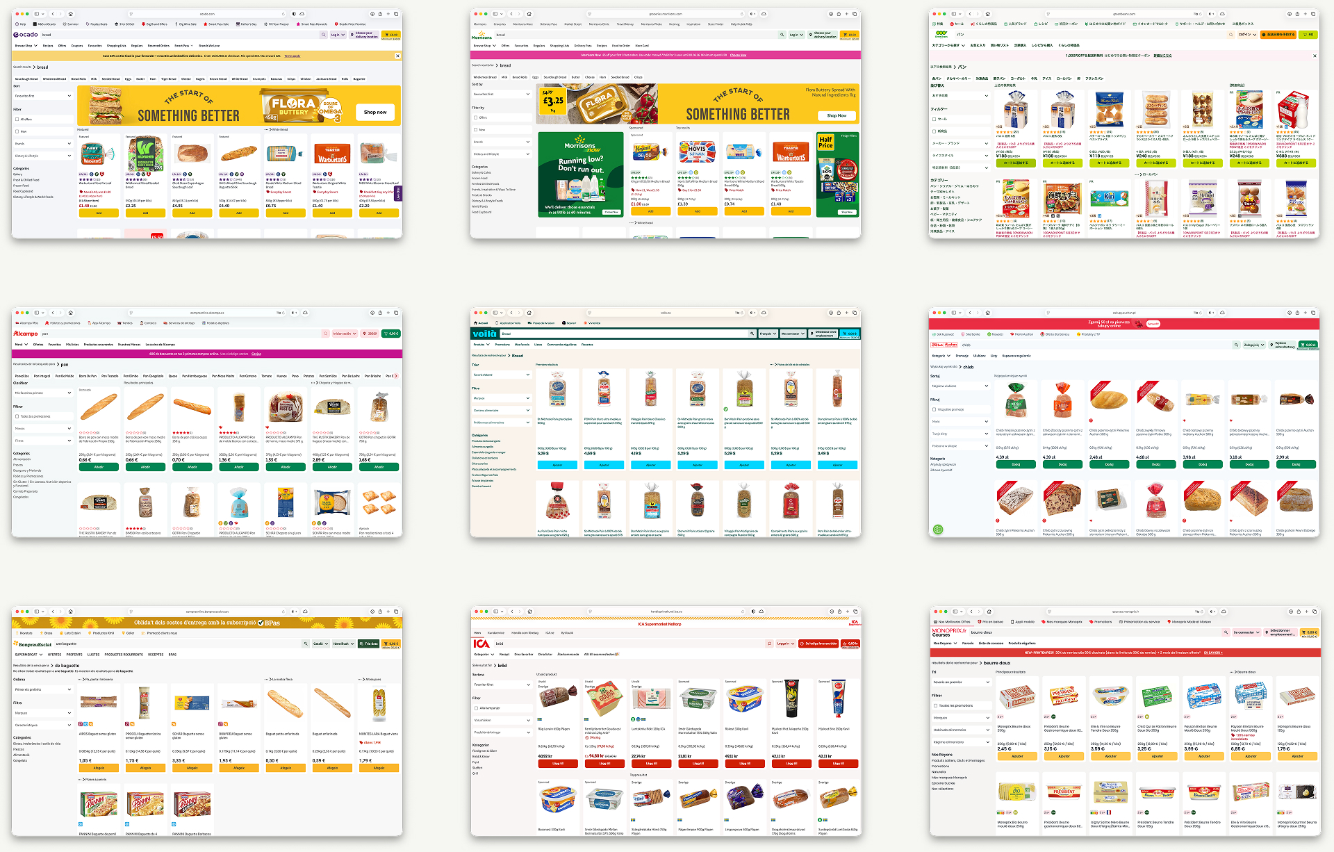
Market complexity added another layer. Designing for Japanese search is a fundamentally different problem to designing for European markets. Words aren't separated by white space, phrases contain symbols and mixed alphabets, and new vocabulary enters the language faster than any standard index can keep up with. Our team had limited knowledge of this space when we started.
Technically, partners had a suite of search tools available but frequently struggled to understand which tool solved which problem. Search management had become a collection of workarounds rather than a coherent system.
Context
Search is the most critical product discovery tool on the OSP platform. With 70% of all product adds coming directly from a search query, and partners ranking search conversion as their most important metric above cash added, margin, and supplier funding, getting search right had direct commercial consequences for every partner on the platform.
I was the sole product designer, working directly with product to shape strategy and delivery across a platform serving 11 retail partners across Europe, Asia, and the Middle East, each with different languages, user behaviours, risk appetites, and commercial priorities.
My focus
Rather than treating each feature as a standalone brief I worked with product to build a coherent ecosystem of search capabilities spanning search suggestions, null results, autocomplete, AI generated synonyms, redirects, ranking, search persistence, and custom dictionary tooling.
My responsibility covered both sides of the platform. On the consumer side I designed the front-end search experience across web and app. On the partner side I designed the B2B tooling within the CMS that gave retail partners the ability to configure, manage, and optimise search for their own customers. The two were closely connected decisions about how search behaved for shoppers were often only possible because of the tooling built to support partners in managing it.
Working through it
A selection of capabilities i worked on
Capability — Search suggestions
Search suggestions had existed on Ocean, Ocado's legacy platform, but hadn't yet been migrated to OSP. This wasn't a straight lift and shift. The migration was an opportunity to rethink how suggestions were surfaced and address limitations in the original implementation.
There were two core problems to solve: improving the visibility of suggestions throughout the search journey, and helping shoppers refine and find there next products faster.
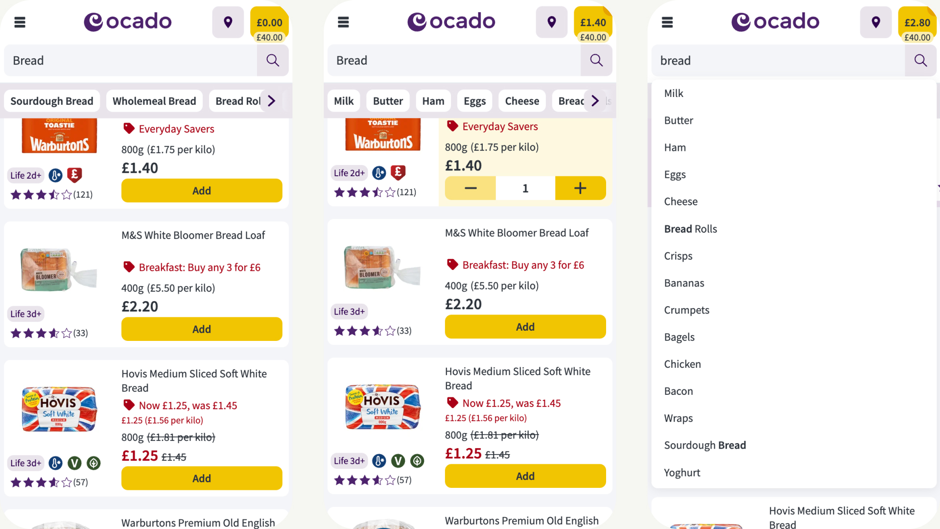
Working closely with product I explored alternative candidates for how suggestions could be surfaced. We introduced suggestions in the search dropdown for immediate discoverability, and designed a search suggestions ribbon that appeared on scroll rather than immediately, keeping the focus on search results first without burying suggestions entirely.
One of the bigger challenges was defining the logic of how search suggestions interacted with other search behaviours such as autocomplete and persistent search terms. Getting that right required close collaboration with engineering to ensure the rules were consistent and predictable across different search states.
Scaling across partners added another layer of complexity. The ribbon needed to work coherently across a range of brand configurations without requiring bespoke implementation for each partner, and colour contrast and legibility had to hold regardless of the theme applied.
We validated the design through an A/B test with time-to-add as the primary metric. Secondary metrics included search conversion, precision, no-results engagement, and cash per converting customer. Zero-result conversion improved by +7% and time-to-add decreased by ~0.92%.
Capability — Clustering and search results architecture
We didn't have a settled answer for how to present search results. Previous research told us users needed to understand the product range quickly, stay organised, and avoid endless scrolling but we hadn't tested any concrete alternatives against the current Ocado experience.
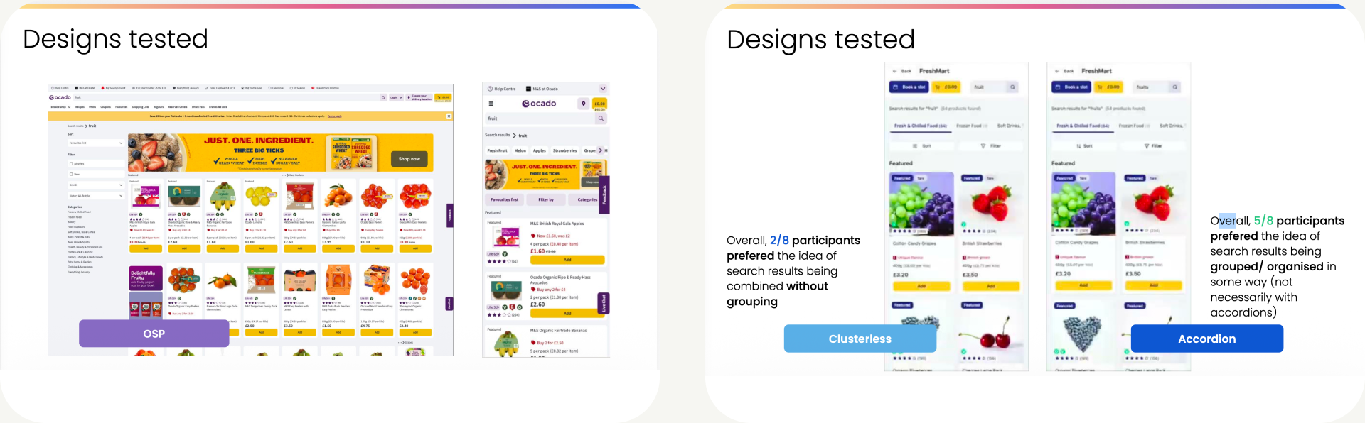
Rather than treat clustering as a single on/off decision, I worked from a hypothesis: the right amount of grouping depends on how specific the search is. A search for "fruit" is broad and benefits from seeing the shape of the category: apples, pears, oranges as distinct groups. A search for "apples" is narrower, so the useful grouping shifts down a level, to apple varieties. A search for "pink lady apples" is specific enough that grouping adds nothing a flat list is fine. I built this as a dynamic accordion that adjusted its grouping level based on query specificity, alongside a clusterless version as the simpler baseline.
I also designed for a relevance problem: broad category searches risk surfacing related items that happen to rank well a search for "fruit" pulling in strawberry ice cream, for example. To address this, I introduced category tabs that pre-selected the dominant department for the search term, keeping results focused on what the user almost certainly meant, while still letting them step across into other departments if they wanted to.
We tested both prototypes against the current OSP experience with 8 users across desktop and mobile, running the same broad-to-specific search pattern (fruit → apples → pink lady apples).
The core hypothesis held up reasonably well the broad/specific split in grouping preference matched what we predicted, with users wanting structure for "fruit" and finding it unnecessary for "pink lady apples." The bias/tabs execution didn't land in the same way: users were largely neutral-to-negative about the tabs, finding them familiar but low-value, and several said they'd be more useful if they reflected the same groupings as the accordion/cluster headings rather than sitting as a separate navigation layer. So the underlying idea protect users from off-topic results on broad searches still holds, but a top-of-page tab bar isn't the right mechanism.
The most useful comparator turned out to be the existing Smart Search Suggestions Ribbon, which was well-liked but misunderstood users expected it to behave like a filter and couldn't tell why it surfaced what it did. That, combined with the split opinion on sorting, gave the team a sharper brief: rather than picking clusterless vs. accordion outright, the next iteration needs to make the SSSR's logic legible, give users a visual sense of the result range, and offer more control over how results are sorted.
Capability — Search redirects
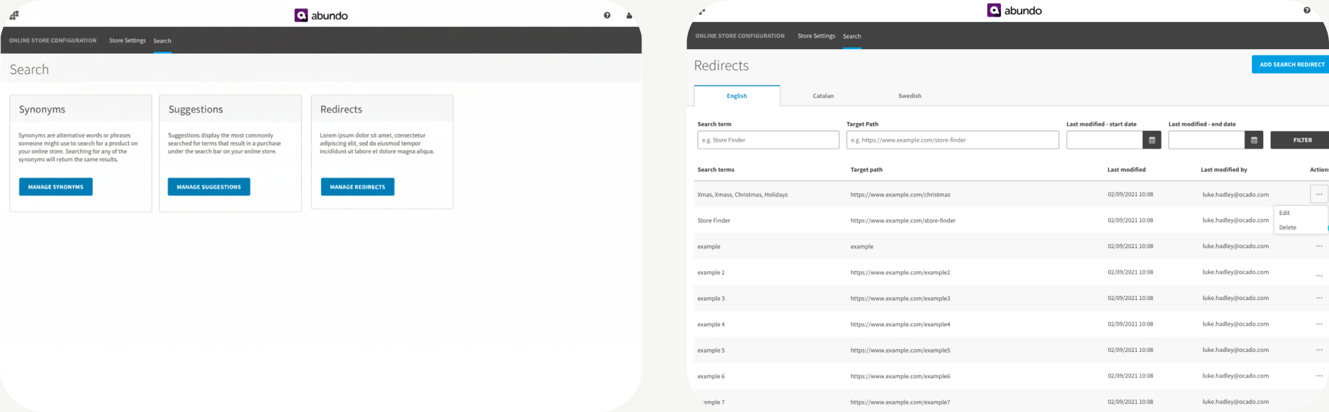
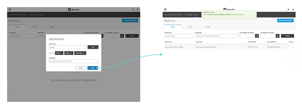
The OSP search product had no way for partners to redirect a specific search term to a destination URL. This created a real gap. Pages created for specific events or customer needs sit outside the search index, meaning shoppers searching for something like a store finder, a seasonal event, or a supplier-funded landing page would either get irrelevant results or hit a null result entirely.
The use cases were varied: redirecting non-product queries like "store finder" or "contact us" to the right page, pointing seasonal searches like "Halloween" or "Christmas" to the relevant event page and updating the destination once the event had ended, and enabling supplier-funded opportunities by routing specific search terms to shop-in-shop or branded landing pages.
This capability imposed a different set of design challenges from the consumer-facing work. The user was a partner team rather than a shopper, the mental model was entirely different, and the edge cases and constraints were more complex. What happens when a redirect conflicts with an existing search term? How do you handle a redirect to an external URL that no longer exists? How do you give partners enough flexibility to manage redirects at scale without creating configuration problems that impact the shopper experience? These were questions that required close collaboration with product and engineering to resolve.
My role was designing the end-to-end back-end flow within the CMS that allowed partners to set up and manage redirects themselves, without engineering involvement, in a way that non-technical partner teams could use confidently.
Capability — Japanese custom dictionary
Our AEON partnership in Japan surfaced a problem nobody on the team had come across before. Our search engine couldn't recognise specific Japanese words, new terms, brand names, cultural references, because Japanese doesn't separate words with white space and frequently introduces new vocabulary that no standard index anticipates.
The consequence was quiet but significant. Customers got incorrect results or no results at all, with no indication of why.
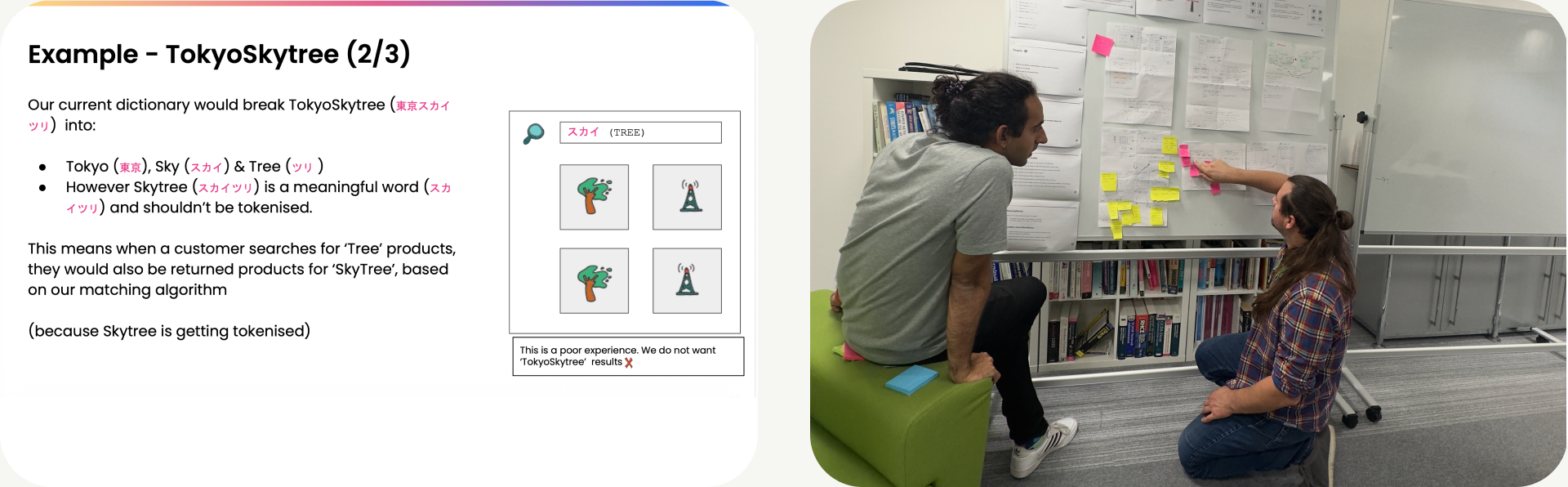
I facilitated a workshop with engineering around a single question: how might we create a self-service solution that enables AEON to manage their own dictionary? The answer was a Custom Dictionary, an entry list of words partners could maintain themselves, allowing search to recognise terms the system wouldn't otherwise understand.
The Tokyo Skytree example made the problem tangible for the team. A search engine with no context for what TokyoSkytree means returns nothing useful. By giving AEON the ability to add custom entries, we reduced the likelihood of that happening.
This one required getting up to speed quickly on a domain I knew little about, working closely with engineering on the technical constraints, and designing a self-service tool that a non-technical partner team could use confidently.
Outcome
Across the search programme, converted searches improved by ~4.78%, precision by +4.43%, and zero-result conversion by +7%. Time to add decreased by ~0.92%.
Reflection
The clustering work was a reminder that inconclusive research is still valuable. We didn't validate a solution but we did invalidate two approaches and came away with a much sharper understanding of what users actually needed, which at that stage was arguably the more useful outcome.
The Japanese dictionary work taught me something about the limits of assumed knowledge. Designing for a market where the fundamental mechanics of language work differently requires curiosity before it requires design skill. Facilitating that engineering workshop was as much about building shared understanding as it was about finding a solution.
A closing note
Search looks simple from the outside. A box you type into and results appear. The complexity is entirely beneath the surface, in how intent is interpreted, how results are ranked, how partners manage and tune the system, and how users from Tokyo to London bring completely different mental models to the same interaction. This programme was about building something coherent underneath all of that.
←Back to portfolio
When search breaks, everything breaks
Designing a coherent search system for global markets across intent, discovery, and results
Company
Ocado Technology | Ecommerce
Tags
B2C · B2B · Strategy · AI
TL;DR
Search drove 70% of product adds on the platform. I led design across the full search system eco system of tools from consumer-facing to B2B tooling across 11 global partners. We improved converted searches improved by ~4.78%, precision by +4.43%, and zero-result conversion by +7%.
Context
Search is the most critical product discovery tool on the OSP platform. With 70% of all product adds coming directly from a search query, and partners ranking search conversion as their most important metric above cash added, margin, and supplier funding, getting search right had direct commercial consequences for every partner on the platform.
I was the sole product designer, working directly with product to shape strategy and delivery across a platform serving 11 retail partners across Europe, Asia, and the Middle East, each with different languages, user behaviours, risk appetites, and commercial priorities.
What made this complex
Search had to work for everyone, which in practice meant it couldn't be optimised for anyone in isolation.
Organisational complexity was a constant. Search touched multiple teams with unclear ownership, and decisions around ranking, filtering, and results behaviour were highly contested, particularly with risk-averse partners like ORL who were reluctant to change something that was broadly working.
Market complexity added another layer. Designing for Japanese search is a fundamentally different problem to designing for European markets. Words aren't separated by white space, phrases contain symbols and mixed alphabets, and new vocabulary enters the language faster than any standard index can keep up with. Our team had limited knowledge of this space when we started.
Technically, partners had a suite of search tools available but frequently struggled to understand which tool solved which problem. Search management had become a collection of workarounds rather than a coherent system.
My focus
Rather than treating each feature as a standalone brief I worked with product to build a coherent ecosystem of search capabilities spanning search suggestions, null results, autocomplete, AI generated synonyms, redirects, ranking, search persistence, and custom dictionary tooling.
My responsibility covered both sides of the platform. On the consumer side I designed the front-end search experience across web and app. On the partner side I designed the B2B tooling within the CMS that gave retail partners the ability to configure, manage, and optimise search for their own customers. The two were closely connected decisions about how search behaved for shoppers were often only possible because of the tooling built to support partners in managing it.
Working through it
A selection of capabilities i worked on
Capability — Search suggestions
Search suggestions had existed on Ocean, Ocado's legacy platform, but hadn't yet been migrated to OSP. This wasn't a straight lift and shift. The migration was an opportunity to rethink how suggestions were surfaced and address limitations in the original implementation.
There were two core problems to solve: improving the visibility of suggestions throughout the search journey, and helping shoppers refine and find there next products faster.
Working closely with product I explored alternative candidates for how suggestions could be surfaced. We introduced suggestions in the search dropdown for immediate discoverability, and designed a search suggestions ribbon that appeared on scroll rather than immediately, keeping the focus on search results first without burying suggestions entirely.
One of the bigger challenges was defining the logic of how search suggestions interacted with other search behaviours such as autocomplete and persistent search terms. Getting that right required close collaboration with engineering to ensure the rules were consistent and predictable across different search states.
Scaling across partners added another layer of complexity. The ribbon needed to work coherently across a range of brand configurations without requiring bespoke implementation for each partner, and colour contrast and legibility had to hold regardless of the theme applied.
We validated the design through an A/B test with time-to-add as the primary metric. Secondary metrics included search conversion, precision, no-results engagement, and cash per converting customer. Zero-result conversion improved by +7% and time-to-add decreased by ~0.92%.
Capability — Clustering and search results architecture
We didn't have a settled answer for how to present search results. Previous research told us users needed to understand the product range quickly, stay organised, and avoid endless scrolling but we hadn't tested any concrete alternatives against the current Ocado experience.
Rather than treat clustering as a single on/off decision, I worked from a hypothesis: the right amount of grouping depends on how specific the search is. A search for "fruit" is broad and benefits from seeing the shape of the category: apples, pears, oranges as distinct groups. A search for "apples" is narrower, so the useful grouping shifts down a level, to apple varieties. A search for "pink lady apples" is specific enough that grouping adds nothing a flat list is fine. I built this as a dynamic accordion that adjusted its grouping level based on query specificity, alongside a clusterless version as the simpler baseline.
I also designed for a relevance problem: broad category searches risk surfacing related items that happen to rank well a search for "fruit" pulling in strawberry ice cream, for example. To address this, I introduced category tabs that pre-selected the dominant department for the search term, keeping results focused on what the user almost certainly meant, while still letting them step across into other departments if they wanted to.
We tested both prototypes against the current OSP experience with 8 users across desktop and mobile, running the same broad-to-specific search pattern (fruit → apples → pink lady apples).
The core hypothesis held up reasonably well the broad/specific split in grouping preference matched what we predicted, with users wanting structure for "fruit" and finding it unnecessary for "pink lady apples." The bias/tabs execution didn't land in the same way: users were largely neutral-to-negative about the tabs, finding them familiar but low-value, and several said they'd be more useful if they reflected the same groupings as the accordion/cluster headings rather than sitting as a separate navigation layer. So the underlying idea protect users from off-topic results on broad searches still holds, but a top-of-page tab bar isn't the right mechanism.
The most useful comparator turned out to be the existing Smart Search Suggestions Ribbon, which was well-liked but misunderstood users expected it to behave like a filter and couldn't tell why it surfaced what it did. That, combined with the split opinion on sorting, gave the team a sharper brief: rather than picking clusterless vs. accordion outright, the next iteration needs to make the SSSR's logic legible, give users a visual sense of the result range, and offer more control over how results are sorted.
Capability — Search redirects
The OSP search product had no way for partners to redirect a specific search term to a destination URL. This created a real gap. Pages created for specific events or customer needs sit outside the search index, meaning shoppers searching for something like a store finder, a seasonal event, or a supplier-funded landing page would either get irrelevant results or hit a null result entirely.
The use cases were varied: redirecting non-product queries like "store finder" or "contact us" to the right page, pointing seasonal searches like "Halloween" or "Christmas" to the relevant event page and updating the destination once the event had ended, and enabling supplier-funded opportunities by routing specific search terms to shop-in-shop or branded landing pages.
This capability imposed a different set of design challenges from the consumer-facing work. The user was a partner team rather than a shopper, the mental model was entirely different, and the edge cases and constraints were more complex. What happens when a redirect conflicts with an existing search term? How do you handle a redirect to an external URL that no longer exists? How do you give partners enough flexibility to manage redirects at scale without creating configuration problems that impact the shopper experience? These were questions that required close collaboration with product and engineering to resolve.
My role was designing the end-to-end back-end flow within the CMS that allowed partners to set up and manage redirects themselves, without engineering involvement, in a way that non-technical partner teams could use confidently.
Capability — Japanese custom dictionary
Our AEON partnership in Japan surfaced a problem nobody on the team had come across before. Our search engine couldn't recognise specific Japanese words, new terms, brand names, cultural references, because Japanese doesn't separate words with white space and frequently introduces new vocabulary that no standard index anticipates.
The consequence was quiet but significant. Customers got incorrect results or no results at all, with no indication of why.
I facilitated a workshop with engineering around a single question: how might we create a self-service solution that enables AEON to manage their own dictionary? The answer was a Custom Dictionary, an entry list of words partners could maintain themselves, allowing search to recognise terms the system wouldn't otherwise understand.
The Tokyo Skytree example made the problem tangible for the team. A search engine with no context for what TokyoSkytree means returns nothing useful. By giving AEON the ability to add custom entries, we reduced the likelihood of that happening.
This one required getting up to speed quickly on a domain I knew little about, working closely with engineering on the technical constraints, and designing a self-service tool that a non-technical partner team could use confidently.
Outcome
Across the search programme, converted searches improved by ~4.78%, precision by +4.43%, and zero-result conversion by +7%. Time to add decreased by ~0.92%.
Reflection
The clustering work was a reminder that inconclusive research is still valuable. We didn't validate a solution but we did invalidate two approaches and came away with a much sharper understanding of what users actually needed, which at that stage was arguably the more useful outcome.
The Japanese dictionary work taught me something about the limits of assumed knowledge. Designing for a market where the fundamental mechanics of language work differently requires curiosity before it requires design skill. Facilitating that engineering workshop was as much about building shared understanding as it was about finding a solution.
A closing note
Search looks simple from the outside. A box you type into and results appear. The complexity is entirely beneath the surface, in how intent is interpreted, how results are ranked, how partners manage and tune the system, and how users from Tokyo to London bring completely different mental models to the same interaction. This programme was about building something coherent underneath all of that.