←Back to portfolio
The emails nobody designs for
The mobile-first redesign of over 15 transactional emails to deliver an easier and contextual omnichannel experience.
Company
New Look | Customer & Checkout
Tags
B2C · Research · IA · UX/UI
TL;DR
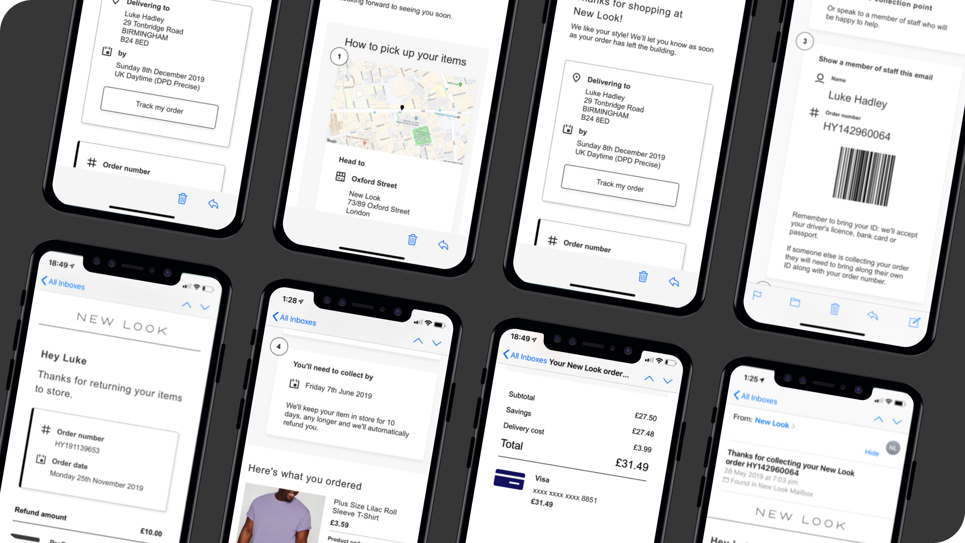
70% of New Look traffic was on mobile and 50% of orders were click & collect but the transactional emails hadn't moved. I led the mobile-first redesign of 15+ emails, adding contextual help and barcode scanning for click & collect. No hard metrics at launch, but store colleagues reported shorter waiting times and customer contact around order status and cancellation queries reduced.
My focus
I was Product Designer (UX) for the Deliver and Care product team at the time, working in collaboration with a PM, BA and email delivery partner Responsys. I was responsible for designing the overall user experience.
Context
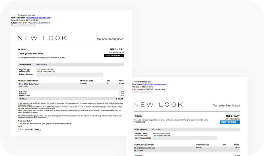
With 70% of our traffic now through our mobile website and 50% of our orders click & collect, it was clear that our transactional emails no longer met the needs, behaviours and expectations of our customers.
Before
Outcome
Launched in March 2019.
We’ve received positive feedback from both customers and our store colleagues, noting shorter waiting times for Click & Collect and a smoother customer experience due to barcode scanning.
Reduced customer contact around “Where’s my order?” & “Cancel my order?” queries due to contextual help topics in each email.
Reflection
At the time I wanted to perform evaluative user testing. However, I found it difficult to come up with an appropriate research methodology that would have adequately simulated customer mindset and context within the time scales and budget.
A closing note
Transactional emails are easy to deprioritise. They don't sit on a conversion funnel, they don't appear in acquisition reports, and nobody celebrates an order confirmation. But that framing misses where the real cost sits.
Every customer who can't find their order status, can't cancel without calling, or can't understand what happens next becomes a contact centre query. At scale those queries are expensive, and they're largely avoidable. A well-designed transactional email isn't just a receipt, it's the first line of customer service. It can answer the question before it gets asked, route customers to the right channel when they need more help, and reserve human support for the cases that genuinely need it.
The best transactional experiences are invisible in the best sense. The customer gets what they need, moves on, and never needs to pick up the phone.
←Back to portfolio
The emails nobody designs for
The mobile-first redesign of over 15 transactional emails to deliver an easier and contextual omnichannel experience.
Company
New Look | Customer & Checkout
Tags
B2C · Research · IA · UX/UI
TL;DR
70% of New Look traffic was on mobile and 50% of orders were click & collect but the transactional emails hadn't moved. I led the mobile-first redesign of 15+ emails, adding contextual help and barcode scanning for click & collect. No hard metrics at launch, but store colleagues reported shorter waiting times and customer contact around order status and cancellation queries reduced.
Context
With 70% of our traffic now through our mobile website and 50% of our orders click & collect, it was clear that our transactional emails no longer met the needs, behaviours and expectations of our customers.
My focus
I was Product Designer (UX) for the Deliver and Care product team at the time, working in collaboration with a PM, BA and email delivery partner Responsys. I was responsible for designing the overall user experience.
Before
Outcome
Launched in March 2019.
We’ve received positive feedback from both customers and our store colleagues, noting shorter waiting times for Click & Collect and a smoother customer experience due to barcode scanning.
Reduced customer contact around “Where’s my order?” & “Cancel my order?” queries due to contextual help topics in each email.
Reflection
At the time I wanted to perform evaluative user testing. However, I found it difficult to come up with an appropriate research methodology that would have adequately simulated customer mindset and context within the time scales and budget.
A closing note
Transactional emails are easy to deprioritise. They don't sit on a conversion funnel, they don't appear in acquisition reports, and nobody celebrates an order confirmation. But that framing misses where the real cost sits.
Every customer who can't find their order status, can't cancel without calling, or can't understand what happens next becomes a contact centre query. At scale those queries are expensive, and they're largely avoidable. A well-designed transactional email isn't just a receipt, it's the first line of customer service. It can answer the question before it gets asked, route customers to the right channel when they need more help, and reserve human support for the cases that genuinely need it.
The best transactional experiences are invisible in the best sense. The customer gets what they need, moves on, and never needs to pick up the phone.