←Back to portfolio
The audit nobody asked for
Unifying our navigation in a growing platform nobody had audited for a long time.
Company
Ocado Technology | Ecommerce
Tags
B2C · Leadership · Strategy · IA · Mobile Apps

TL;DR
Nobody asked me to do this. The OSP platform had grown to 12 retail partners and 1.3 million users without anyone reviewing the underlying navigation end to end. I built the case from scratch a six-page proposal connecting navigation debt to SEO, AI system performance, and market expansion. I secured cross-functional buy-in, conducted a full audit across iOS and Android, and established navigation principles with engineering that had never been formally defined. 17 inconsistencies documented, initial fixes shipped, principles handed to the design system team.
What made this complex
This wasn't a project with a brief, a budget, or a team. It sat outside the roadmap with no dedicated capacity and no clear ownership, partly because navigation touches the entire end-to-end journey rather than sitting neatly within any single product team.
Getting traction meant convincing people that a problem existed before I could even propose a solution. The audience wasn't just designers. I needed engineers, product managers, and senior stakeholders including engineering managers and product directors to care enough to act.
Context
The OSP ecommerce platform had grown significantly since launching with a single retail partner in 2017. By the time I started looking at this, it was supporting 12 retail partners and over 1.3 million active users across web, iOS, and Android. New content types, shopping tools, and categories had been added over the years but the underlying information architecture and navigation had never been reviewed end to end.
Nobody had asked me to look at it. I could see the cracks forming and decided to build a case.
My focus
I approached this in three phases. First, making the problem visible and credible enough to warrant investment. Second, conducting a rigorous audit once I had the team and capacity to do it properly. Third, turning the findings into shared standards that would outlast the immediate fixes and have a life beyond the working group.
Working through it
Building the case
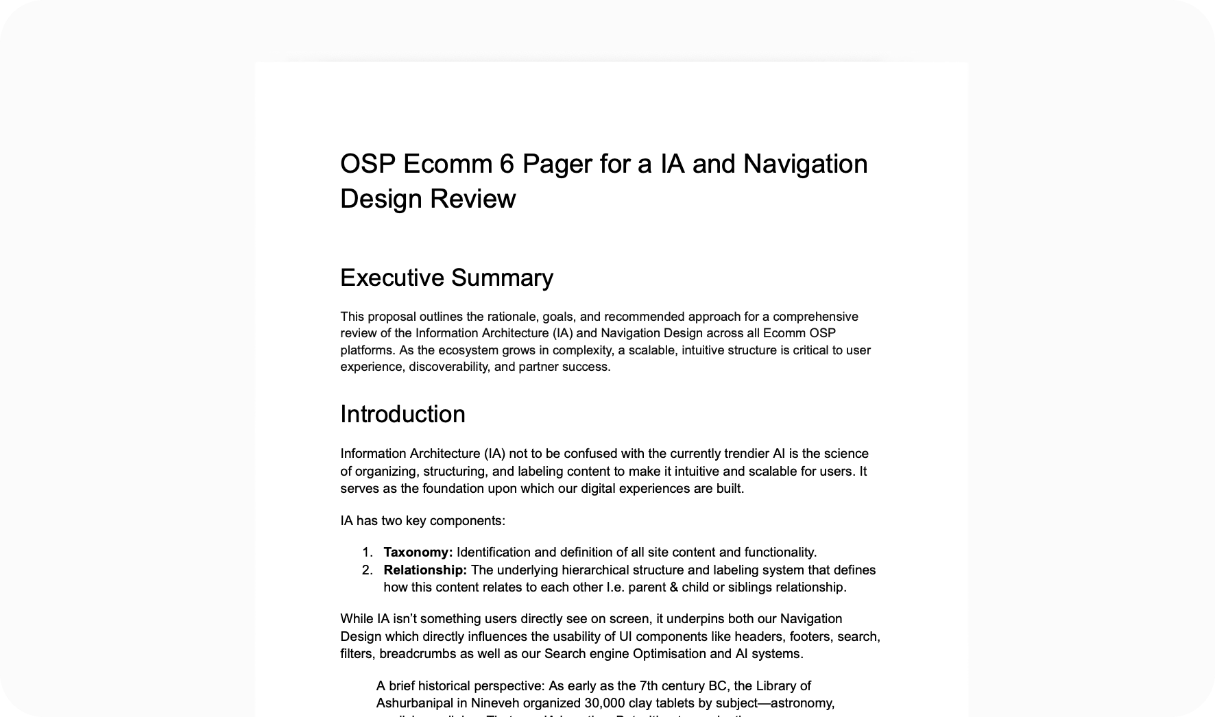
Before doing any audit work I needed to establish that the problem was worth solving. I authored a six-page proposal setting out the rationale, evidence, and recommended approach for a comprehensive IA and navigation review. The 6 pager drew on partner feedback, internal research, analytics, and known engineering pain points to build a cross-functional case rather than a UX-only one. The argument connected navigation debt to SEO impact, AI system performance, and the platform's ability to scale into new markets like Japan and Korea.
The audience was broad engineers, product managers, UX, and senior stakeholders including engineering managers and product directors. The proposal secured buy-in and resulted in dedicated capacity being allocated.
The audit
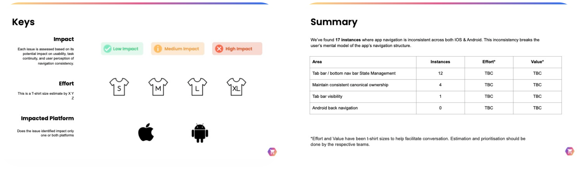
With a team in place I conducted a thorough audit of the mobile app navigation across iOS and Android, pulling input from engineering and UXR to make sure I wasn't missing platform-specific context. I documented 17 instances of inconsistent navigation behaviour, grouping them by area, assessing impact on usability and task continuity, and sizing effort using t-shirt estimates to facilitate conversation rather than commit to timelines prematurely.
From audit to standards
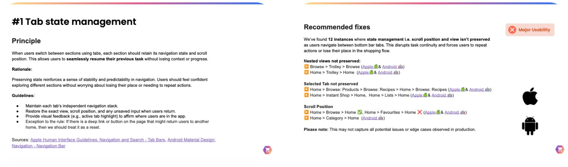
I formed a working group with iOS and Android engineers to work through how navigation should behave natively across both platforms, establishing principles around tab state management, canonical ownership, tab bar visibility, and back navigation. Rather than imposing a design solution this was about building shared understanding of what correct behaviour actually looked like, something the platform had never formally defined.
I brought the findings back to product who helped classify the issues under the new prioritisation framework. Some quick wins shipped. The principles were shared more broadly and I began working with the design system team to formally document them, giving the work a longer shelf life beyond the immediate fixes.
Outcome
17 instances of navigation inconsistency identified and documented across iOS and Android. A set of navigation principles established and shared across design and engineering. Initial fixes shipped. Principles in progress for inclusion in the design system.
Reflection
One thing this project reinforced was the importance of building shared expectations rather than just shared documentation. Getting iOS and Android engineers in the same room to define expected navigation behaviour produced something design work alone couldn't have achieved. It created ownership across the team rather than a set of principles people felt had been handed to them.
It also sharpened how I think about platform conventions. A lot of navigation inconsistency on the platform had crept in because nobody had explicitly decided when to follow iOS and Android conventions and when to deliberately deviate from them. Both are valid choices but they need to be conscious ones. Part of what the working group established was a clearer framework for making that call, knowing when aligning with native platform behaviour was the right answer and when the product experience justified going its own way.
A closing note
Navigation is one of those things that only gets noticed when it breaks.
The goal of this work wasn't to redesign or introducer new UI patterns. It was to establish a foundation based on shared principles that would let the platform grow without inconsistencies compounding further. A platform serving 12 partners across multiple markets has a particular challenge, the navigation needs to be coherent enough to feel consistent, but flexible enough to accommodate the different ways partners structure their content and build their site maps. Getting that balance right requires principles not prescriptions, and a system flexible enough to accommodate them.
That coherence, underpinned by a strong IA, is what makes everything else work.
←Back to portfolio
The audit nobody asked for
Unifying our navigation in a growing platform nobody had audited for a long time.
Company
Ocado Technology | Ecommerce
Tags
B2C · Leadership · Strategy · IA · Mobile Apps
TL;DR
Nobody asked me to do this. The OSP platform had grown to 12 retail partners and 1.3 million users without anyone reviewing the underlying navigation end to end. I built the case from scratch a six-page proposal connecting navigation debt to SEO, AI system performance, and market expansion. I secured cross-functional buy-in, conducted a full audit across iOS and Android, and established navigation principles with engineering that had never been formally defined. 17 inconsistencies documented, initial fixes shipped, principles handed to the design system team.
Context
The OSP ecommerce platform had grown significantly since launching with a single retail partner in 2017. By the time I started looking at this, it was supporting 12 retail partners and over 1.3 million active users across web, iOS, and Android. New content types, shopping tools, and categories had been added over the years but the underlying information architecture and navigation had never been reviewed end to end.
Nobody had asked me to look at it. I could see the cracks forming and decided to build a case.
What made this complex
This wasn't a project with a brief, a budget, or a team. It sat outside the roadmap with no dedicated capacity and no clear ownership, partly because navigation touches the entire end-to-end journey rather than sitting neatly within any single product team.
Getting traction meant convincing people that a problem existed before I could even propose a solution. The audience wasn't just designers. I needed engineers, product managers, and senior stakeholders including engineering managers and product directors to care enough to act.
My focus
I approached this in three phases. First, making the problem visible and credible enough to warrant investment. Second, conducting a rigorous audit once I had the team and capacity to do it properly. Third, turning the findings into shared standards that would outlast the immediate fixes and have a life beyond the working group.
Working through it
Building the case
Before doing any audit work I needed to establish that the problem was worth solving. I authored a six-page proposal setting out the rationale, evidence, and recommended approach for a comprehensive IA and navigation review. The 6 pager drew on partner feedback, internal research, analytics, and known engineering pain points to build a cross-functional case rather than a UX-only one. The argument connected navigation debt to SEO impact, AI system performance, and the platform's ability to scale into new markets like Japan and Korea.
The audience was broad engineers, product managers, UX, and senior stakeholders including engineering managers and product directors. The proposal secured buy-in and resulted in dedicated capacity being allocated.
The audit
With a team in place I conducted a thorough audit of the mobile app navigation across iOS and Android, pulling input from engineering and UXR to make sure I wasn't missing platform-specific context. I documented 17 instances of inconsistent navigation behaviour, grouping them by area, assessing impact on usability and task continuity, and sizing effort using t-shirt estimates to facilitate conversation rather than commit to timelines prematurely.
From audit to standards
I formed a working group with iOS and Android engineers to work through how navigation should behave natively across both platforms, establishing principles around tab state management, canonical ownership, tab bar visibility, and back navigation. Rather than imposing a design solution this was about building shared understanding of what correct behaviour actually looked like, something the platform had never formally defined.
I brought the findings back to product who helped classify the issues under the new prioritisation framework. Some quick wins shipped. The principles were shared more broadly and I began working with the design system team to formally document them, giving the work a longer shelf life beyond the immediate fixes.
Outcome
17 instances of navigation inconsistency identified and documented across iOS and Android. A set of navigation principles established and shared across design and engineering. Initial fixes shipped. Principles in progress for inclusion in the design system.
Reflection
One thing this project reinforced was the importance of building shared expectations rather than just shared documentation. Getting iOS and Android engineers in the same room to define expected navigation behaviour produced something design work alone couldn't have achieved. It created ownership across the team rather than a set of principles people felt had been handed to them.
It also sharpened how I think about platform conventions. A lot of navigation inconsistency on the platform had crept in because nobody had explicitly decided when to follow iOS and Android conventions and when to deliberately deviate from them. Both are valid choices but they need to be conscious ones. Part of what the working group established was a clearer framework for making that call, knowing when aligning with native platform behaviour was the right answer and when the product experience justified going its own way.
A closing note
Navigation is one of those things that only gets noticed when it breaks.
The goal of this work wasn't to redesign or introducer new UI patterns. It was to establish a foundation based on shared principles that would let the platform grow without inconsistencies compounding further. A platform serving 12 partners across multiple markets has a particular challenge, the navigation needs to be coherent enough to feel consistent, but flexible enough to accommodate the different ways partners structure their content and build their site maps. Getting that balance right requires principles not prescriptions, and a system flexible enough to accommodate them.
That coherence, underpinned by a strong IA, is what makes everything else work.