←Back to portfolio
Making exploration feel intentional
Redesigning the New Look app Explore page to turn browsing intent into product discovery
Company
New Look | Mobile Apps
Tags
B2C · Research · IA · Mobile Apps
TL;DR
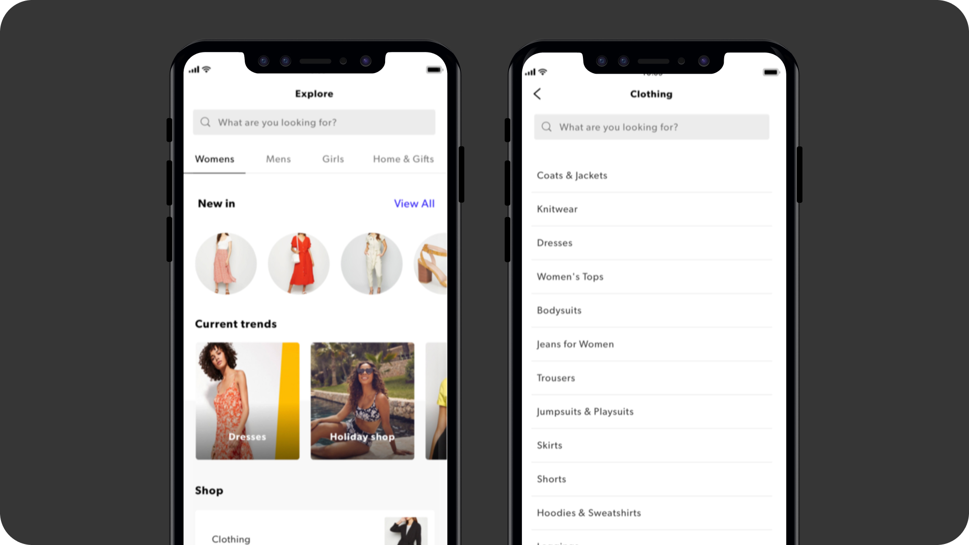
The New Look app Explore page had low conversion and a CMS structure that made a clean fix technically difficult. I led the IA and navigation redesign starting with an empathy mapping workshop and an analytics deep dive that showed 37% of Explore visits going straight to View All, a clear signal the content wasn't working. Guerrilla usability testing in-store validated the direction. In the first four weeks after launch: 109% uplift in Explore visits, 106% uplift in conversion, 161% increase in revenue, and a forecasted £1.2M in incremental annual sales.
What made this complex
The underlying category structure was constrained by the CMS, making a clean category tree difficult to achieve technically. On top of this, the existing Explore page was trying to do too much a cognitively overwhelming, uncurated feed that buried high-value content like New In, which was front of mind for customers and central to the brand proposition. The challenge wasn't just design, it was working within real technical limits to create something that felt effortless.
Context
The New Look mobile app Explore page was underperforming. Preliminary data showed low conversion from browse to product views, suggesting customers were struggling to find what they were looking for. With mobile a core part of the New Look proposition, this was a meaningful commercial problem worth solving properly.
My focus
I led the UX, working in collaboration with a dedicated UI designer and a full-stack scrum team including a PM, BA, tech lead, four developers, and QA. My focus was on the information architecture, navigation patterns, and interaction behaviours — defining how to group content into curated sub-pages and surface New In without losing the balance between trend and core categories.
Working through it
I started by facilitating an empathy mapping workshop with key stakeholders to surface assumptions and align on user needs before touching any design. A deep dive into analytics followed we found 37% of Explore visits went straight to View All, with a significant portion then going on to search, a strong signal that the content wasn't meeting needs.
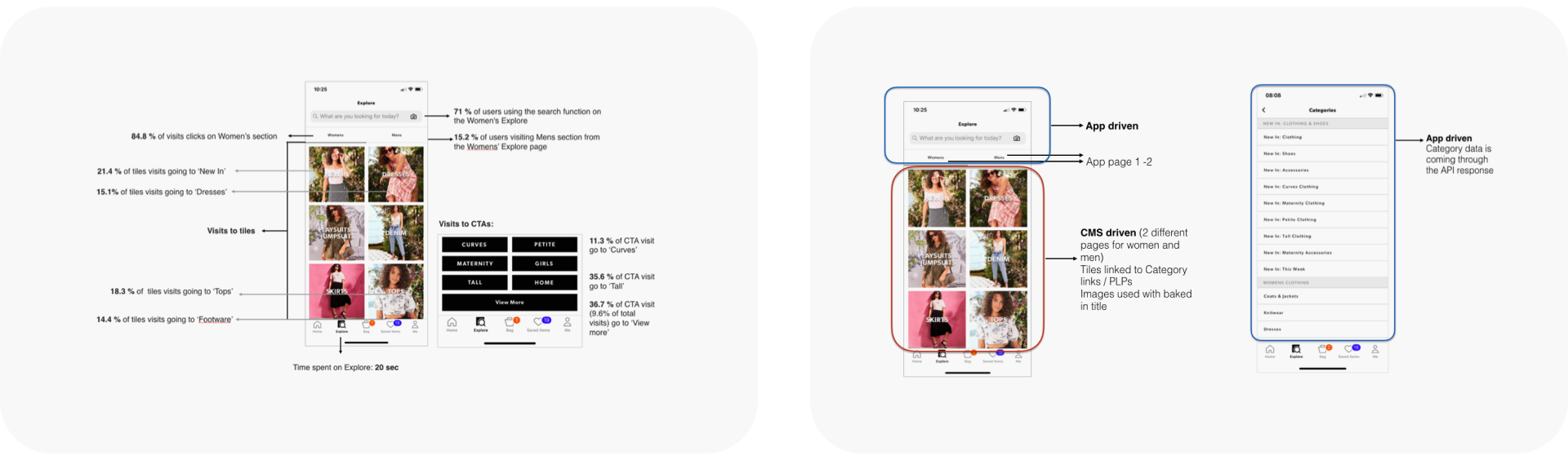
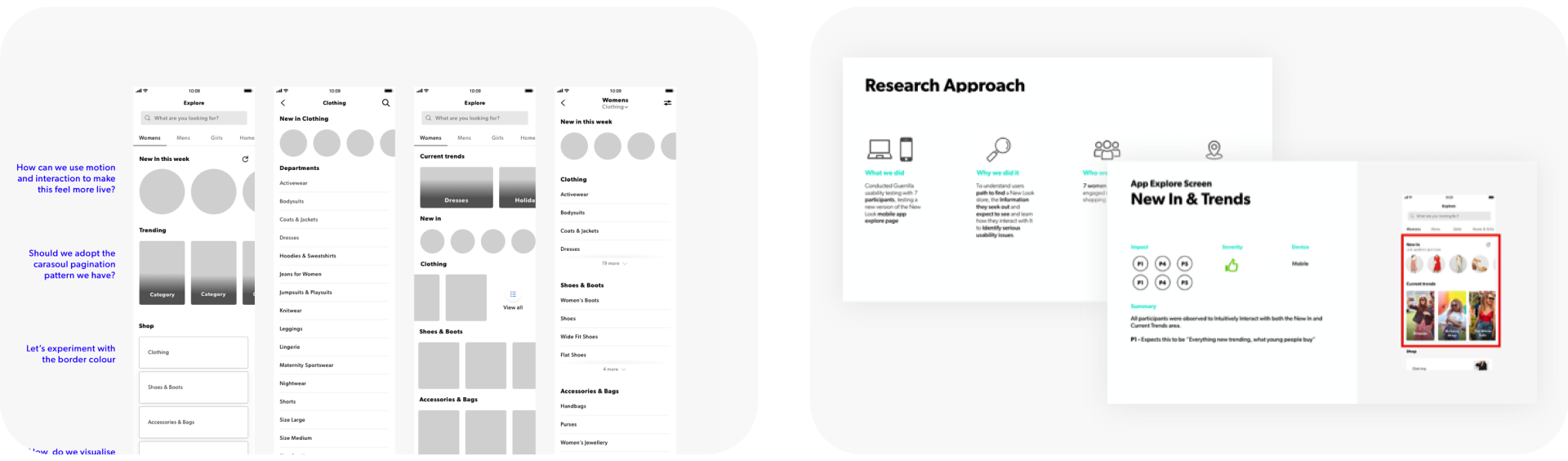
From there I moved into rapid ideation using paper, sketch, and InVision, prototyping different navigation patterns and information hierarchies. When we had a working prototype I mapped our assumptions and riskiest design decisions into a matrix to shape a focused discussion guide. Given budget and time constraints I ran guerrilla usability testing with seven participants in a New Look store, using a high fidelity prototype as stimulus. No critical issues were found.
Outcome
Launched September 2019. In the first four weeks we saw a 109% uplift in Explore page visits, 106% uplift in conversion, and 104% uplift in AOV, resulting in a 161% increase in revenue and a forecasted £1.2M in incremental annual sales. Generic search terms decreased, and engagement with the New In feature was strong from day one.
Reflection
Given the time constraints and clear evidence of user problems, I made a deliberate call to move into ideation without deeper generative research. In hindsight, more upfront research into user needs could have surfaced insights beyond what the data alone told us. That said, the results validated the approach and the experience sharpened how I think about when generative research earns its place versus when existing evidence is sufficient to move forward confidently.
A closing note
This project reinforced something I carry into every discovery: analytics tell you where people are struggling, but they rarely tell you why. The empathy mapping and testing were what turned a data signal into a design direction. The CMS constraints also taught me to treat technical limitations as a design input early, not a problem to solve later.
←Back to portfolio
Making exploration feel intentional
Redesigning the New Look app Explore page to turn browsing intent into product discovery
Company
New Look | Mobile Apps
Tags
B2C · Research · IA · Mobile Apps
TL;DR
The New Look app Explore page had low conversion and a CMS structure that made a clean fix technically difficult. I led the IA and navigation redesign starting with an empathy mapping workshop and an analytics deep dive that showed 37% of Explore visits going straight to View All, a clear signal the content wasn't working. Guerrilla usability testing in-store validated the direction. In the first four weeks after launch: 109% uplift in Explore visits, 106% uplift in conversion, 161% increase in revenue, and a forecasted £1.2M in incremental annual sales.
Context
The New Look mobile app Explore page was underperforming. Preliminary data showed low conversion from browse to product views, suggesting customers were struggling to find what they were looking for. With mobile a core part of the New Look proposition, this was a meaningful commercial problem worth solving properly.
What made this complex
The underlying category structure was constrained by the CMS, making a clean category tree difficult to achieve technically. On top of this, the existing Explore page was trying to do too much a cognitively overwhelming, uncurated feed that buried high-value content like New In, which was front of mind for customers and central to the brand proposition. The challenge wasn't just design, it was working within real technical limits to create something that felt effortless.
My focus
I led the UX, working in collaboration with a dedicated UI designer and a full-stack scrum team including a PM, BA, tech lead, four developers, and QA. My focus was on the information architecture, navigation patterns, and interaction behaviours — defining how to group content into curated sub-pages and surface New In without losing the balance between trend and core categories.
Working through it
I started by facilitating an empathy mapping workshop with key stakeholders to surface assumptions and align on user needs before touching any design. A deep dive into analytics followed we found 37% of Explore visits went straight to View All, with a significant portion then going on to search, a strong signal that the content wasn't meeting needs.
From there I moved into rapid ideation using paper, sketch, and InVision, prototyping different navigation patterns and information hierarchies. When we had a working prototype I mapped our assumptions and riskiest design decisions into a matrix to shape a focused discussion guide. Given budget and time constraints I ran guerrilla usability testing with seven participants in a New Look store, using a high fidelity prototype as stimulus. No critical issues were found.
Outcome
Launched September 2019. In the first four weeks we saw a 109% uplift in Explore page visits, 106% uplift in conversion, and 104% uplift in AOV, resulting in a 161% increase in revenue and a forecasted £1.2M in incremental annual sales. Generic search terms decreased, and engagement with the New In feature was strong from day one.
Reflection
Given the time constraints and clear evidence of user problems, I made a deliberate call to move into ideation without deeper generative research. In hindsight, more upfront research into user needs could have surfaced insights beyond what the data alone told us. That said, the results validated the approach and the experience sharpened how I think about when generative research earns its place versus when existing evidence is sufficient to move forward confidently.
A closing note
This project reinforced something I carry into every discovery: analytics tell you where people are struggling, but they rarely tell you why. The empathy mapping and testing were what turned a data signal into a design direction. The CMS constraints also taught me to treat technical limitations as a design input early, not a problem to solve later.